Website Refresh & Brand Evolution
GoHenry operates in a crowded market where most competitors are free. The old site wasn't justifying the fee — it was disjointed, visually tired, and rushing people into a funnel before they understood why they should care. We stripped it back, found the real story — a financial education platform giving kids a genuine head start in life — and rebuilt everything around that. New value proposition, new visual language, new design system. The result was a site that earned the sign-up rather than just demanding it.
Role Design Director
In house GoHenry
Year 2026
THE PROBLEM
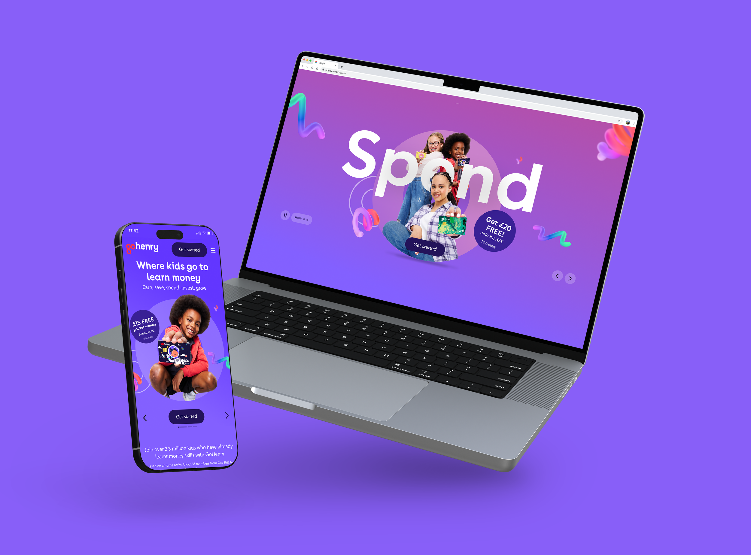
The GoHenry website had a lot going on — and none of it was working together. Outdated visuals, inconsistent design across pages, no design system, and a funnel-first architecture that pushed people towards sign-up before they'd understood why they should care. CTAs everywhere, message hierarchy nowhere.
The deeper problem was strategic. GoHenry charges a monthly fee in a market where competitors like Revolut <18 and Monzo are free. The old site didn't come close to justifying that. It felt corporate, cluttered, and frankly a little tired.
The Strategic Bet
Fighting on features wasn't an option — every competitor had a comparable set. Fighting on price was a losing battle from the start.
The insight was that GoHenry isn't really a debit card. It's a financial education platform for families — and that's something none of the free alternatives could genuinely claim. The fee isn't a cost, it's an investment in your kid's future. From that came the value proposition we built everything around: GoHenry: Where kids go to learn money.
The site needed to earn the fee before it asked for it.
Brand Evolution
Once we had the strategic foundation, it became clear the existing visual language couldn't carry the new story. The brand had drifted — it felt safe and generic where it needed to feel warm, purposeful, and alive.
The website refresh became the launchpad for a broader brand evolution. We pushed the visual identity to better reflect the energy and ambition of the new positioning — a brand that genuinely believes it's giving kids a head start in life, and looks like it means it.
What We Did
Information architecture
Rebuilt the page flow around the user's emotional journey. Lead with the why (education, aspiration, real outcomes for families), earn trust, then ask for the sign-up. No more funnel-first panic.
Design system
Built a comprehensive design system in Figma from scratch. Components, tokens, style guides — the lot. Gave the team a shared language and made engineering handoffs significantly faster.
Visual language
Elevated the creative execution across every touchpoint. Motion, interaction, and high-quality assets to create a site that rewards exploration rather than just processing traffic.
Messaging hierarchy
Developed the brand manifesto and value proposition framework that cascaded across the site and into wider marketing touchpoints.
THE OUTCOME
Early testing showed the new site was pulling in higher-intent users — fewer people entering the funnel, but a meaningfully stronger conversion rate once they did. Exactly the quality-over-volume shift the strategy intended.