
GoHenry — Brand Evolution
GoHenry — Brand Evolution
The opportunity
Free competitors were multiplying. The existing visuals, motion and audio felt too soft, too safe. In a market where the product costs money, the brand needed to earn its keep. Evolution, not revolution.
The idea
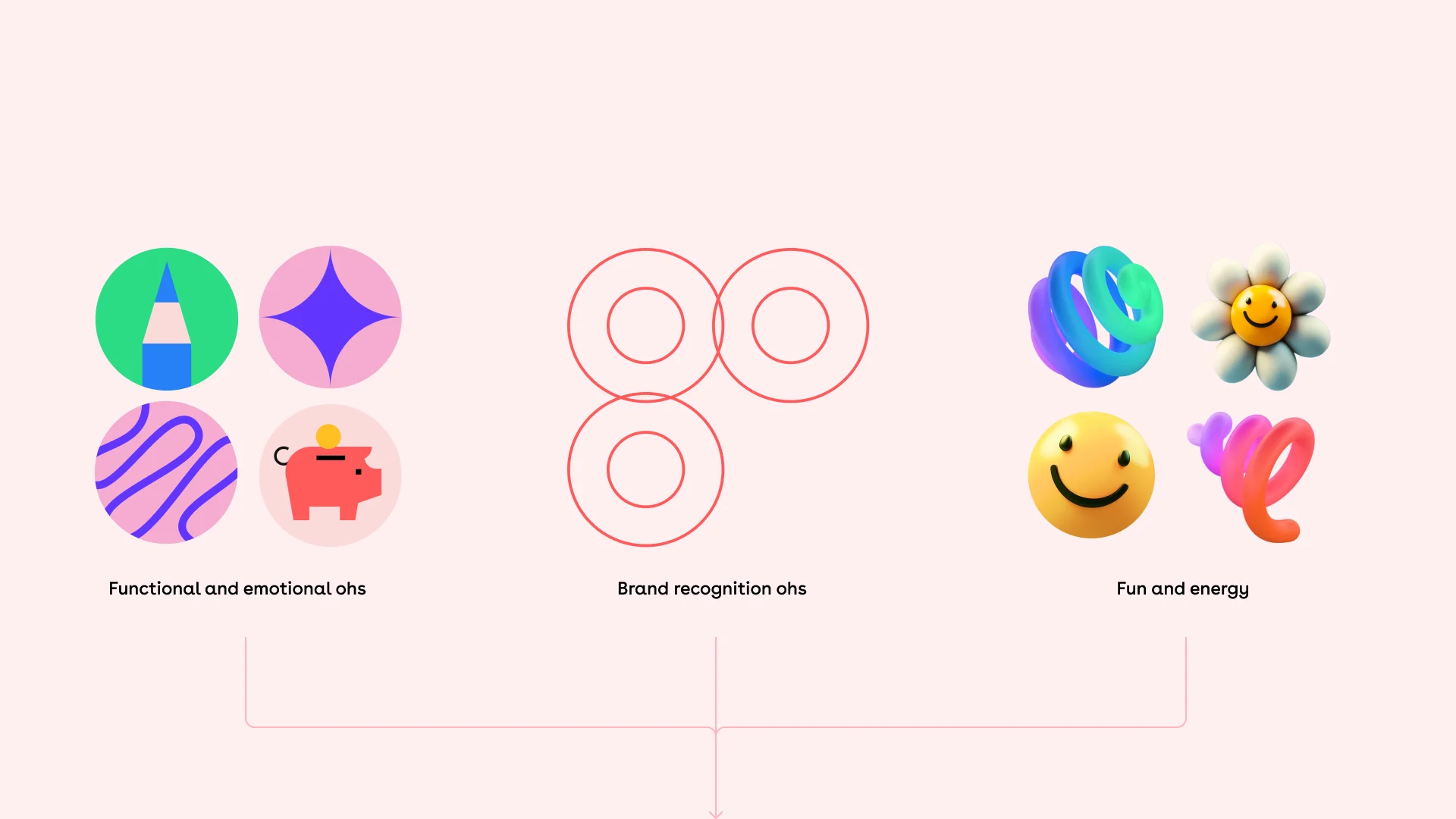
Three OHs in GoHenry. Each one maps to a stage of a child's financial journey. Together they gave the brand a voice, and a reason to exist, that no free competitor could credibly claim.
OH?
Curious & inquisitive
The question that starts everything. Exploring money, asking why, building the habit of curiosity.
OH!
Surprising & enlightening
The moment something clicks. The surprise of earning, the excitement of hitting a savings goal.
It all makes sense
When financial knowledge stops being abstract and becomes genuinely useful.
The identity
Our core ingredient that tells the story and makes each piece uniquely GoHenry.
The O's are ever-present, communicating a moment, an energy / emotion and a goal or learning.
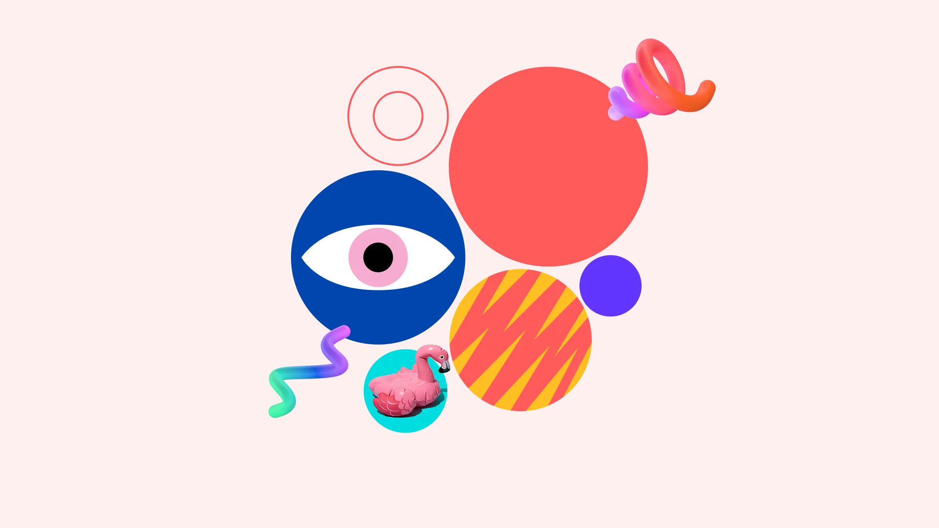
Colour
A third colour that warms the system without breaking what people already recognise.
Imagery
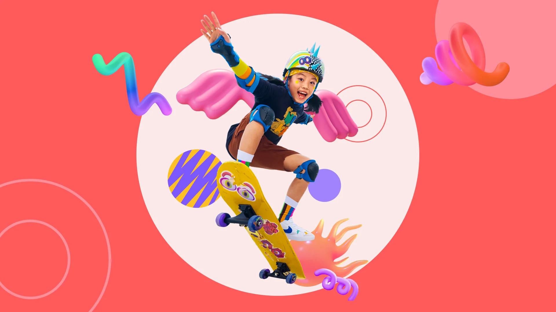
A system built to go everywhere. Designed to roll out consistently across every touchpoint: paid ads, web, print, partnerships, motion.
Paid media & campaigns
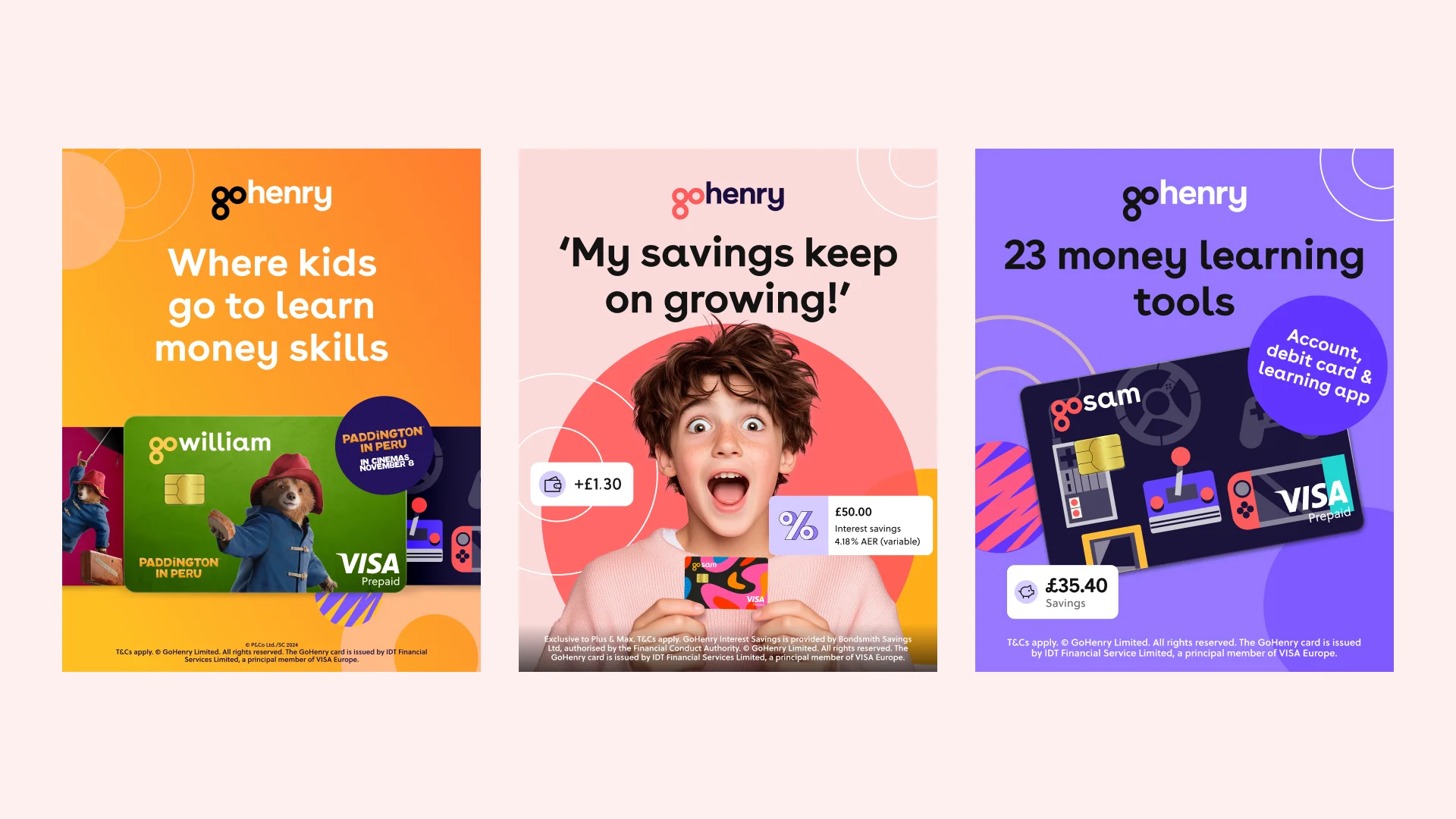
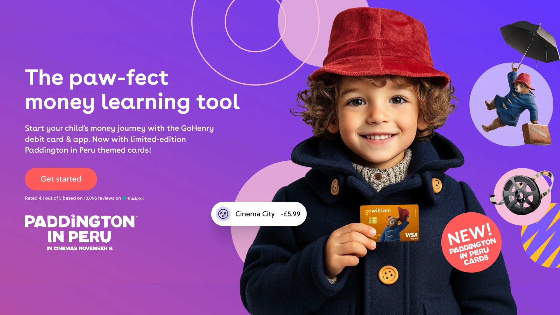
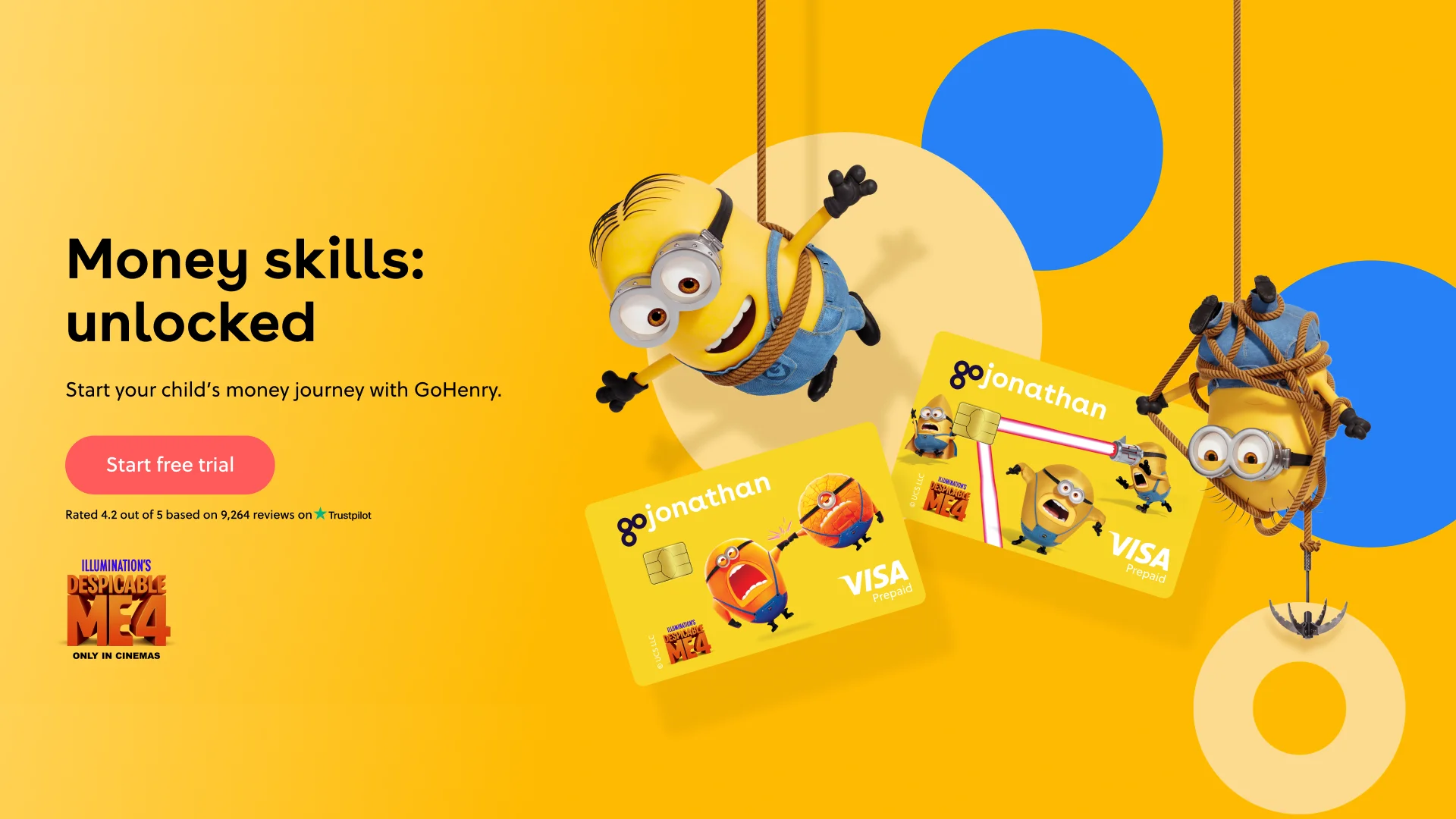
IP partnerships
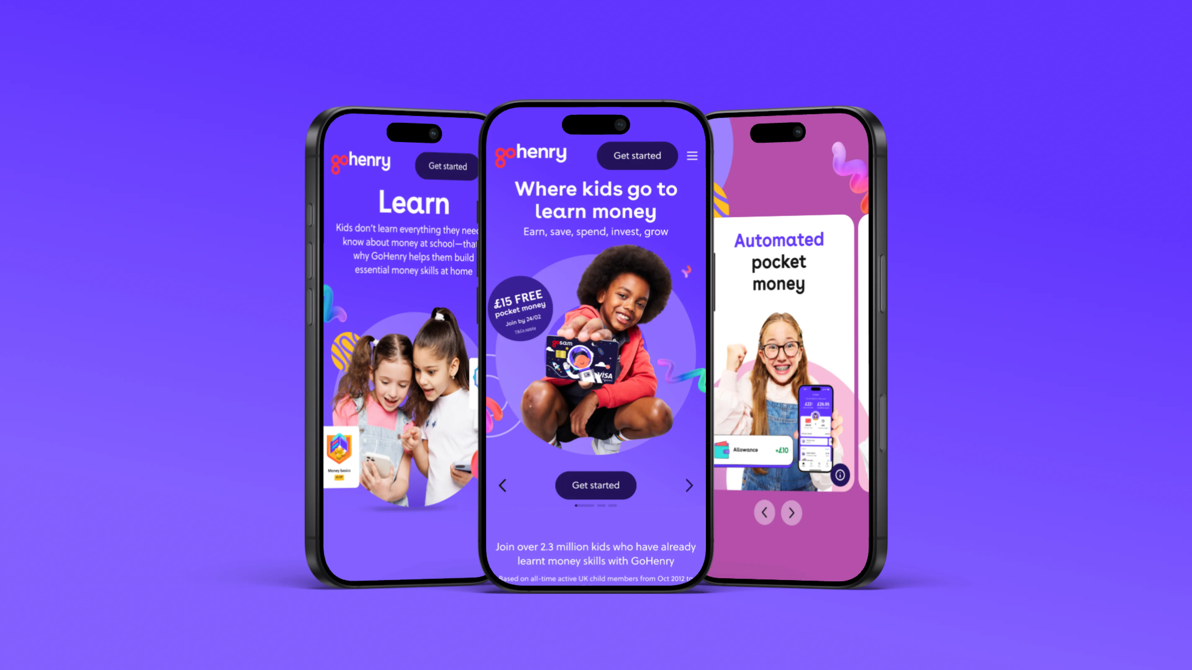
Website & digital
Brand in motion
Not a product demo. A proof of the brand's emotional promise. The OH platform brought to life.